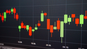
Candlestick charts are one of the oldest types of charts used in financial trading. They are still popular today because they are visually appealing and relatively easy to interpret. One of the benefits of using candlestick charts is that they provide a good visual representation of the market sentiment. If the close price is higher than the open price, the candlestick will be green, and if the close price is lower than the open price, the candlestick will be red. Candlesticks can also be used to identify reversal patterns, which can be used to predict future price movements. Some of the most common reversal patterns include the doji, hammer, and hanging man. Keep reading to learn more about candlestick graphs.
What are candlestick charts?

Candlestick charts are used to indicate the price movement of a security over a period of time. They are composed of a series of candlesticks, each of which represents the opening, high, low, and closing prices of the security during that period.
The body of the candlestick is filled with the color that corresponds to the direction of the price movement. If the security’s price increases during the period, the body of the candlestick is filled with the color that corresponds to the upward direction. If the security’s price decreases during the period, the body of the candlestick is filled with a color that corresponds to the downward direction.
The candlestick’s color and shape can also provide information about the security’s price movement. For example, if the candlestick is filled with the color that corresponds to the upward direction and it has a long body, this indicates that the security’s price increased significantly during the period. Conversely, if the candlestick is filled with the color that corresponds to the downward direction and it has a long body, this indicates that the security’s price decreased significantly during the period.
How can you read a candlestick chart?

The candlesticks can be used to identify the trend of the security, the strength of the trend, and when the trend is changing. The first thing you need to understand about candlestick charts is what the different elements of the candlesticks represent. The open is the first price of the day, the high is the highest price reached during the day, the low is the lowest price reached during the day, and the close is the last price of the day.
The candlesticks can be used to identify the trend of the security. A security is in a bull market when the candlesticks have a bullish pattern, and a security is in a bear market when the candlesticks have a bearish pattern. The strength of the trend can be identified by looking at the size of the candlesticks. A large candlestick means that the security had a large price change from the open to the close, and a small candlestick means that the security had a small price change from the open to the close.
The trend can also be identified by the direction of the candles. A candle that is pointing up is bullish, and a candle that is pointing down is bearish. When the candles are pointing in the same direction, it is called a confirmation.
Candlesticks can prove to be an asset for complex securities data analysis and can also be used to identify when the trend is changing. When the candles start to form a different pattern than what was previously seen, it is an indication that the trend is changing.
The purpose of candlestick charts is mainly to help investors, and traders better understand the price action and sentiment of a security by analyzing the relationship between the open, high, low, and close of the candlesticks. These charts are a great data visualization tool to help illustrate patterns and trends with securities. Additionally, candlestick patterns can give clues about future price movements.


